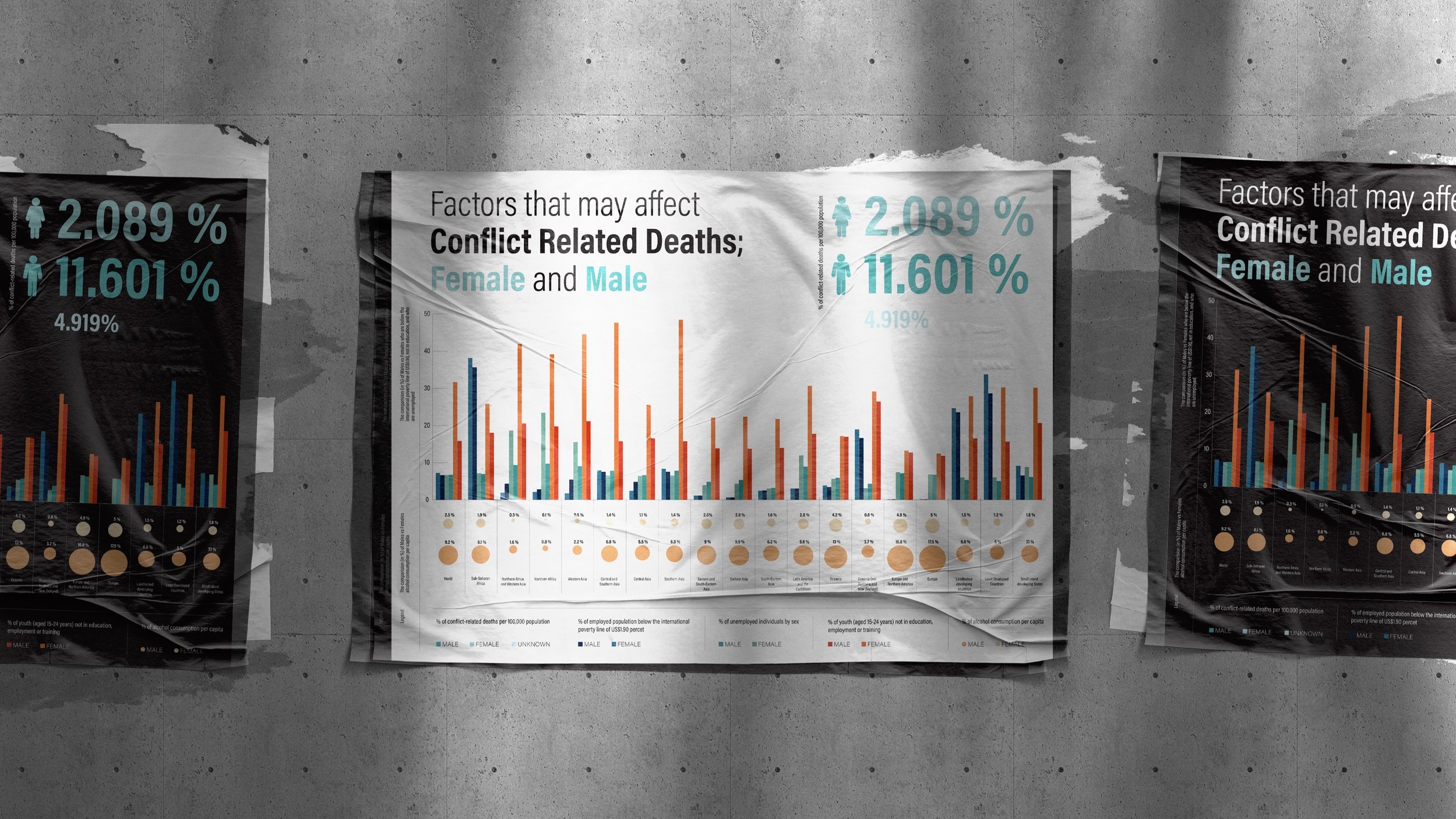
Information design poster. Factors that may affect Conflict Related Deaths; Female and Male
The goal of this project is to compare factors that may affect conflict-related deaths for both males and females based on location. Any data that was shown in percentages I compared in a single bar graph to easily show which percentages were higher and/or lower. I tried a few different graph types but the bar graph was definitely the easiest way for the viewer to compare the data. For the other data, although also represented by a percentage, I used a visual dot graph because the unit of measurement was different from the previous set of data. I showed the percentage with the size of the dots, while also labelling them for accuracy. After a few failed attempts at trying to represent my most important piece of data, I decided to show it typographically. It was the clearest way to show the total percentage of conflict-related deaths for both males and females.
As for the colours I had a few different colour palettes I wanted to use but ended up choosing my original option. I did end up having to change a few colours as they were difficult to tell apart but other than that they worked well. I looked at a few different typefaces but also went with my first choice (Acumin Variable Concept).


